Study and Re-design Hudson's Bay Website
"Retail institution Hudson’s Bay Company has origins dating back to 1670, but in 2017 it’s having to pivot to digital to secure a future."
Stuart Lauchlan, Diginomica Journalist
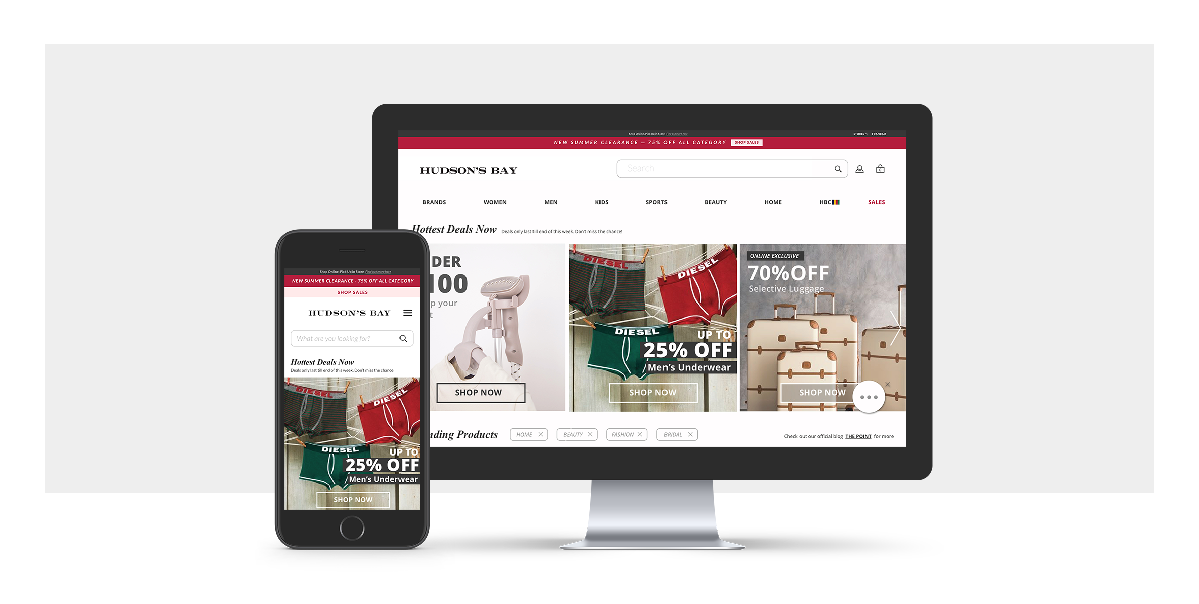
Problem & Objective
'Canada's iconic department store: Hudson’s Bay' Hudson’s Bay has been accompanying Canadian’s lifestyle with a wide range of products. Although their business is extensive, their online presence has not been portraying the company's capacity sufficiently. As today’s consumer activity is heavily on e-commerce, Hudson’s Bay is making an effort in creating a better digital appearance as Gerald Storch, CEO of HBC says,
"We are operating under the assumption that the business will remain difficult and that we’re going to have to have a more efficient, nimbler model than our competitors, lower our cost of doing business, particularly in bricks-and-mortar and we’re going to grow rapidly online to compensate for that. We want to have the shift that’s able to do that in these turbulent condition. We are focused on no excuses, leading the pack, doing the things we have to do to get ahead of this, so that we don’t have to sit here and apologize quarter after quarter for not doing our numbers."
The objective of this study is to re-design Hudson’s Bay Website that holds together the company’s shattered identity and effectively displays user needs.
Design Process
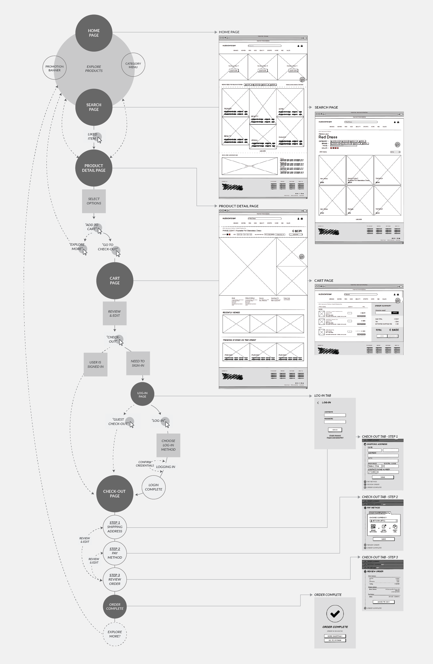
Identify the current website’s problem through user testing and synthesize the findings into design opportunities.
Opporunity #1 - Hudson’s Bay serves so many divisions. The current website runs these divisions in separate sites without any coherence. The website should have a common ground for separated channels to give consistant user experience.
Opportunity #2 - The site is hard to navigate with repeated information and an irregular interface pattern. The website should contain concise information architecture and have natural interface pattern.
Opporunity #3 - The site contains a lot of products and easy busy telling the user what they can offer but is not doing a good job at learning what the user wants. The website should communicate both ways and think in user’s perspective.

1. Be Canadian
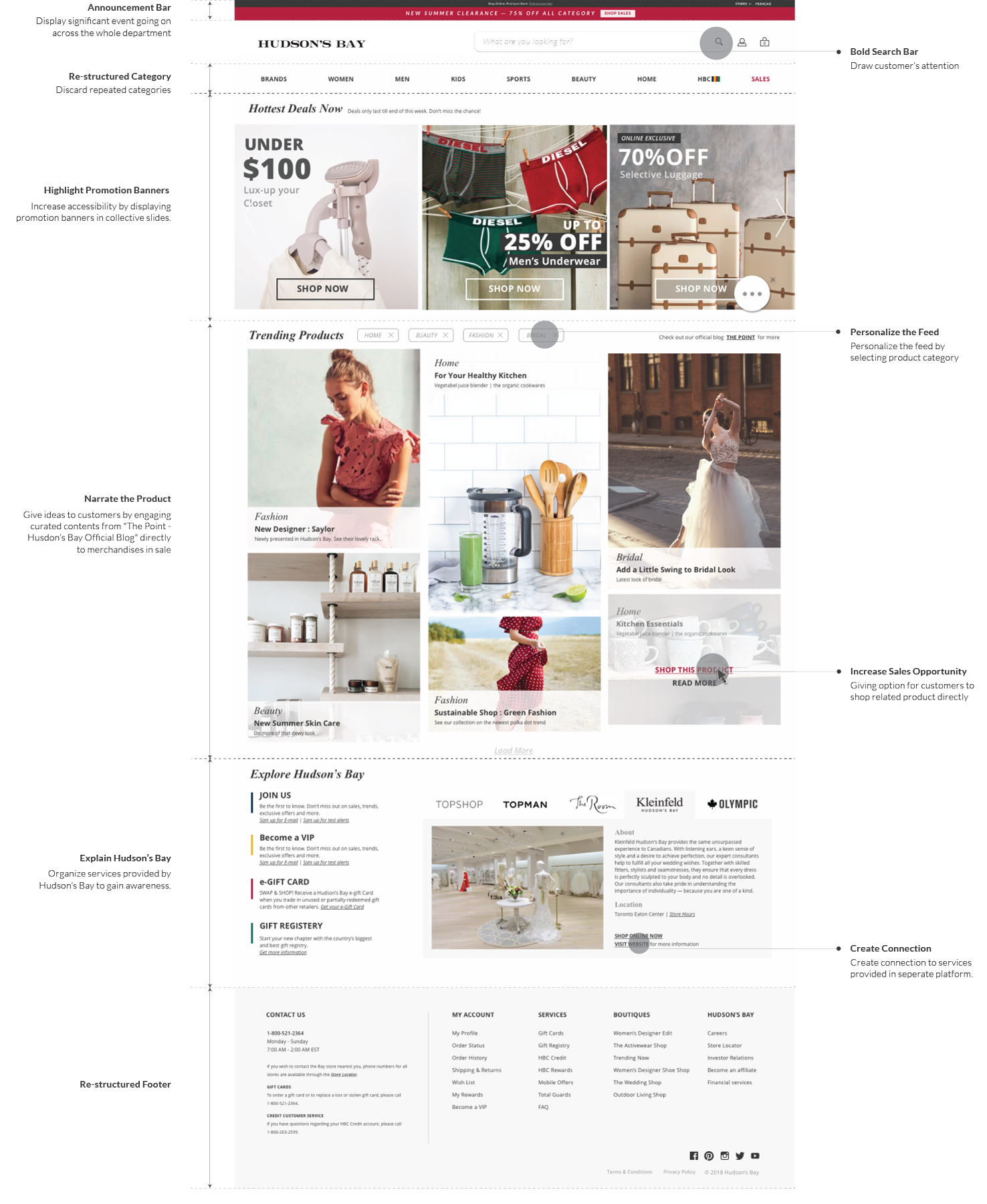
Hudson’s Bay should take advantage of the favoured reputation of being “Canadian” and melt-in their Canadian identity into their presense to distinguish from others.

2. Keep It Neat
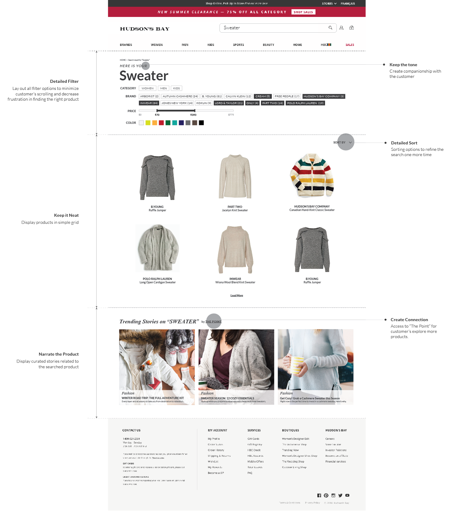
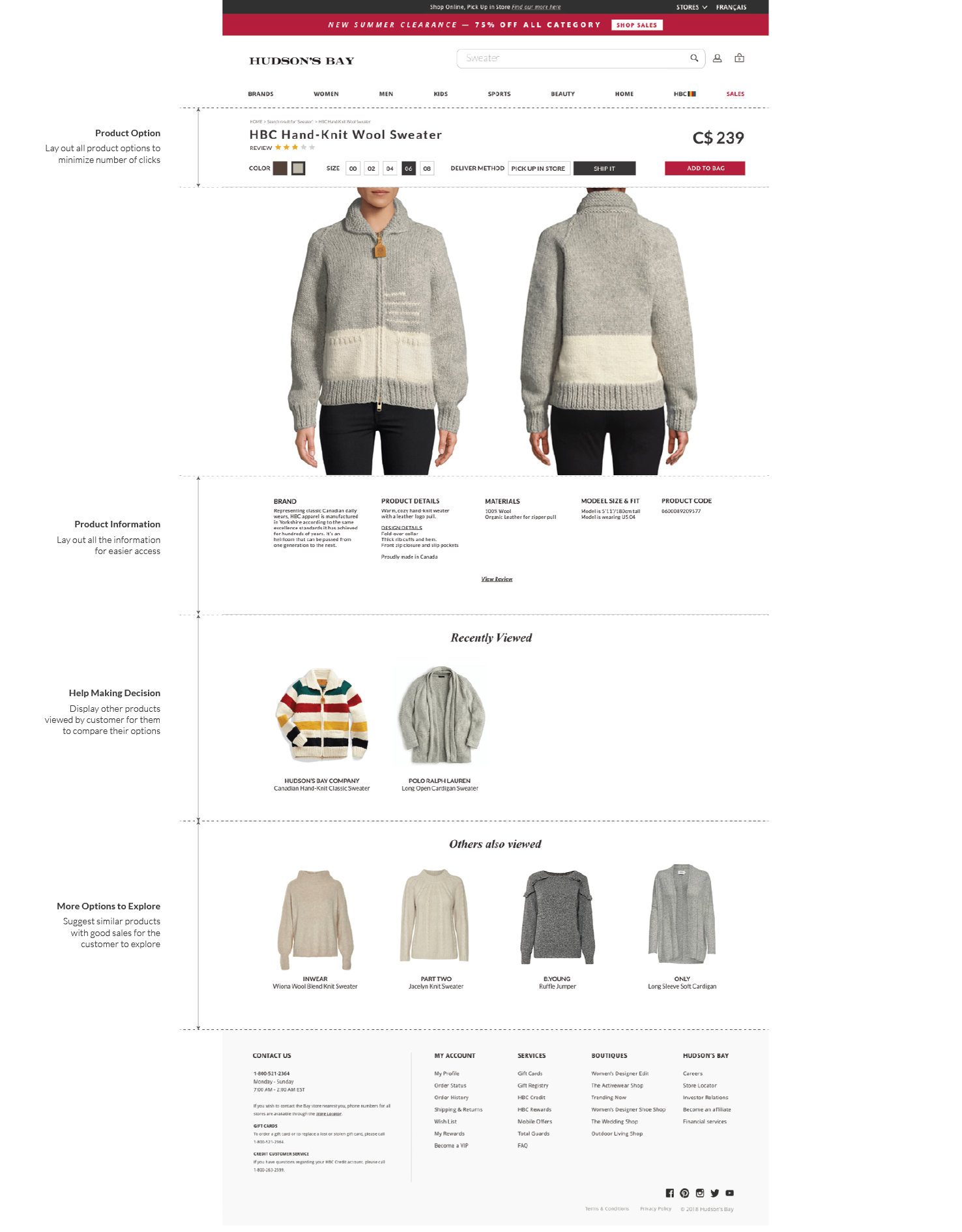
Hudson’s Bay covers so many different products, brands and services, it’s easy to miss what they offer. The website should eliminate repeated information and display the services through one channel.

3. Narrate the Product
Hudson’s Bay runs a separate blog that creates jewel stone contents. The website should tie in the blog contents to products in sales.

4. Personalize
Create sense of companionship and make shopping experience tailored to the customer.
